
Collaborative Marketing Campaign
Jimu
About the Project
Goal: Throughout the entire 4th semester, there was comprehensive marketing campaign project focused on sustainable products. Our brand is called “JIMU” it means like gym (workout) with you. It is a sustainable activewear brand made from biodegradable bamboo fabric. The message conveyed by the JIMU brand promotes an eco-friendly lifestyle while encouraging accessible, light and easy exercises to pursue a healthy life.
This project was originally a group project for the entire semester. Our team consisted of four members, and we completed the logo and all other project components. However, even though the project was technically finished, I didn’t want to leave parts I wasn’t fully satisfied with. So, I decided to further develop those areas to the best of my ability. I plan to refine these elements when I work on my portfolio during the semester.
Type : my self
Duration: 2 weeks
Skills: Ai, Ps, Figma, Xd

This was the original logo for our final project. We initially designed it with a block-like structure, similar to stacking LEGO blocks, to convey a sense of fun and vibrant energy. However, I decided to redesign the logo, aiming for a simpler and more readable look that aligns better with an activewear brand.


There were many strong design options I created, along with valuable feedback from my professors. In the end, I chose this design because it strikes a balance between simplicity and active style. It feels refined yet playful, making it something people can wear confidently without hesitation—it’s both chic and charming.

Also, here are starter kit package boxes available in small, medium and large sizes, which include 1 water bottle, 1 pair of shorts and 1 t-shirt offered at a discounted price on designated dates.
Many people don’t know how to start working out, so we created a kit that brings together essential items, making it affordable and convenient to get started. JIMU is also a brand that aims to inspire people to enjoy fitness as a fun way to lead a healthy life. We want to convey the message of taking care of both our bodies and the planet—working toward a healthier self while contributing to a healthier Earth.


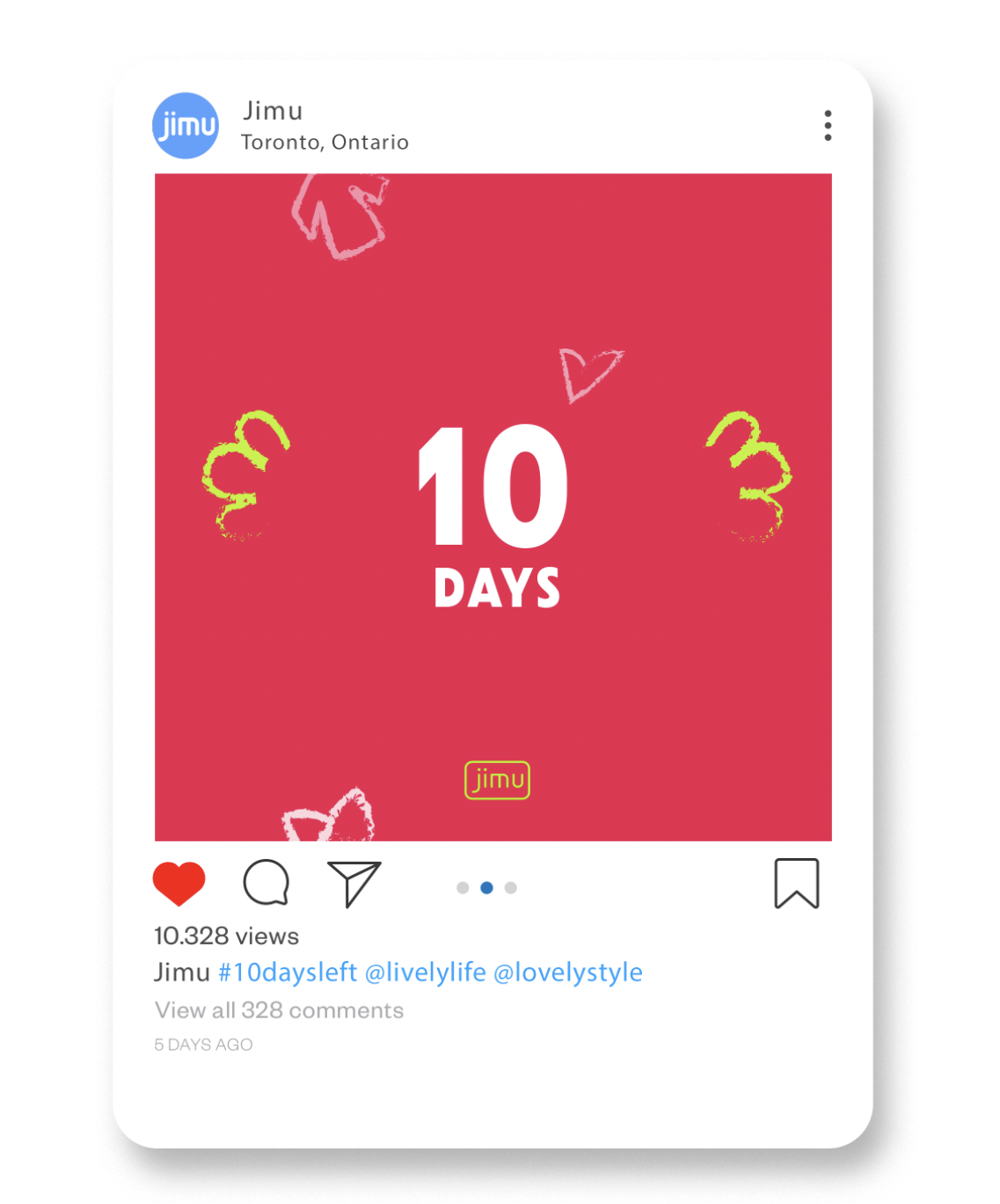
For our advertising on Instagram, billboards, and posters, Jimu brand’s main colours are blue, pink, dark grey and neon colours, along with secondary colours were perfectly align with it’s intensive, bright, and refreshing qualities.
Additionally, the cute wings and other hand-drawn graphic elements add a playful and light-hearted touch.


I've attached a link to the JIMU website I created in Adobe XD. You can click on the monitor to view a zoomed-in version.

