packaging redesigns
For package redesign projects, the task involved reimagining two products: one for a chocolate brand and another of choice. The selected chocolate brand was “Merch”, and the second product was a mold remover box. The following demonstrates how their designs were transformed.
About the Project
Goal: The task was to redesign various types of information, such as airplane tickets, TTC tickets, work schedule, floss instructions, and maps used in daily life. I chose to redesign a mold removal box, which is something commonly seen at home.
Type : Myself
Duration: 7 weeks
Skills: Ai, Ps, Procreate
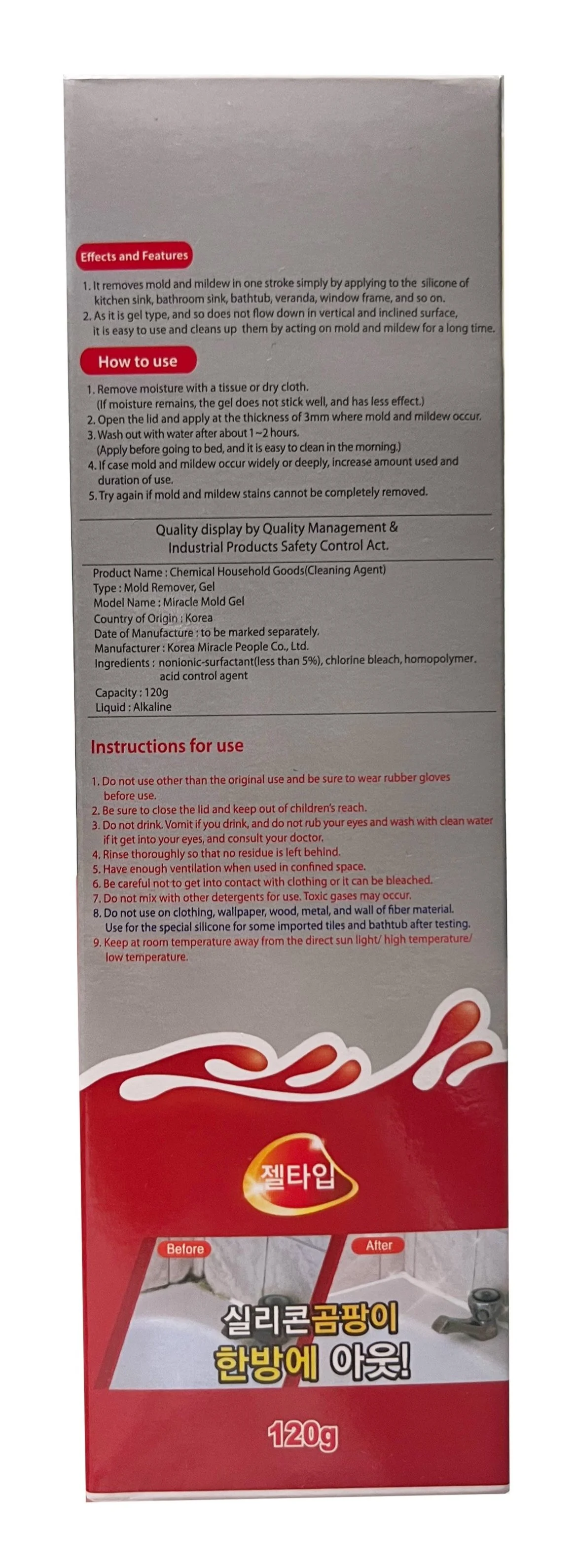
This is the original current packaging.
Discovered several issues with the original mold remover gel package design. There was 1. repeating information 2. text was too small, 3. no icons, and 4. no pictorial instruction etc.
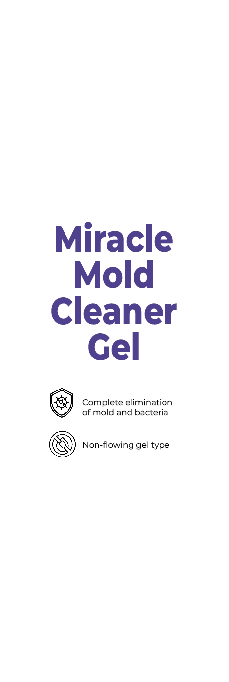
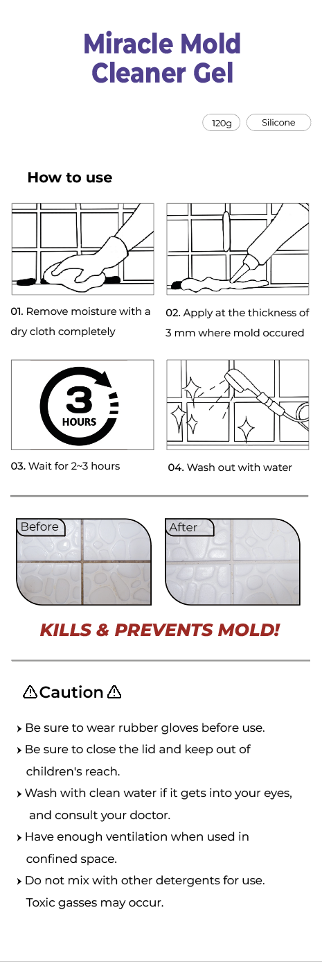
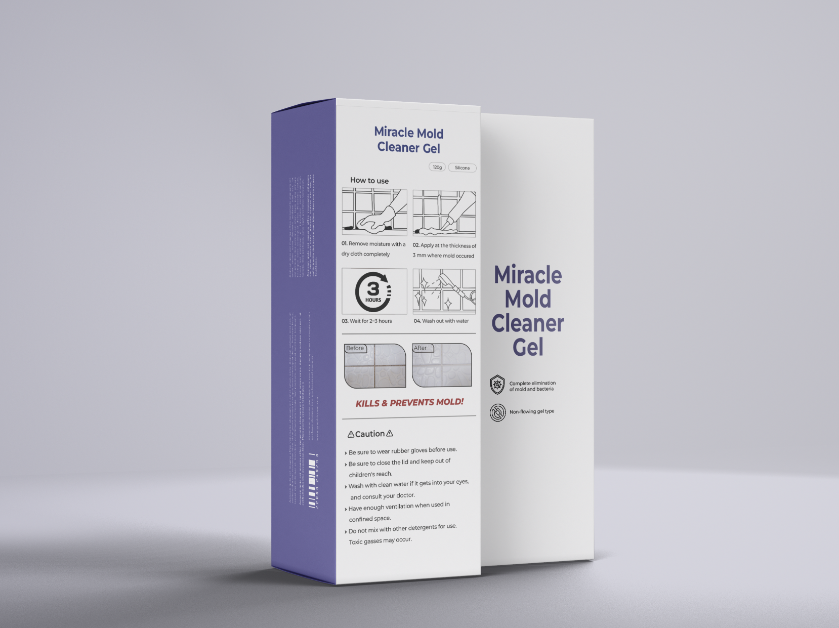
To address these problems and make the design more user-friendly, the mold remover packaging was redesigned. Slightly changed the font size, removed redundant information to the side. Also, added icons, pictorial instructions and changed grey background to white to make it look cleaner and easier to read.
About the Project
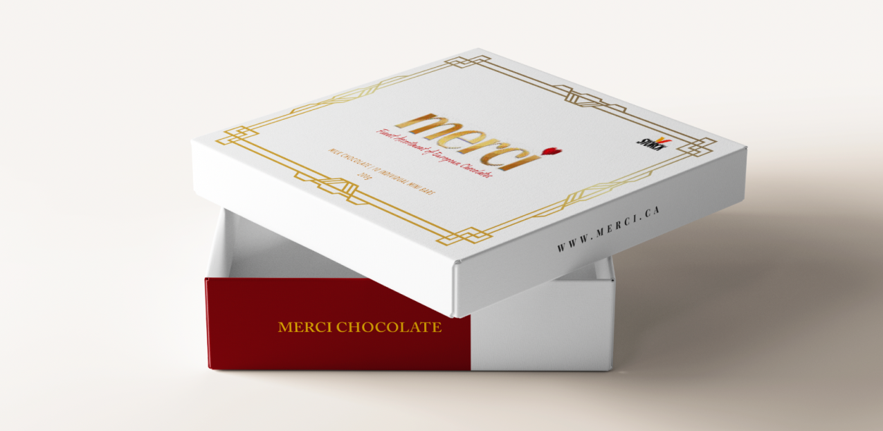
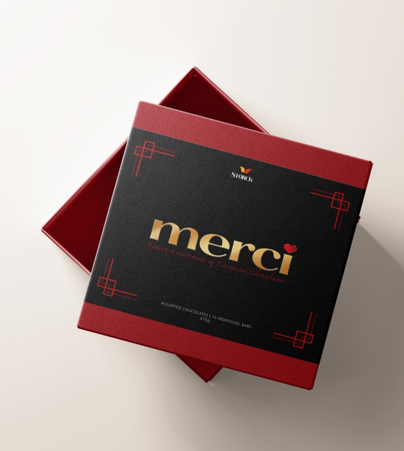
Goal: “Merci” chocolate box was selected for redesign vintage chocolate project, focused on its original features, history, brand colors first, and a chose a theme, which were presented as part of the project. The chosen theme was Art Deco, emphasizing the harmony of geometric patterns with gold or silver gradients to enhance the luxurious appeal of the chocolate.
Type : Myself
Duration: 7 weeks
Skills: Ps
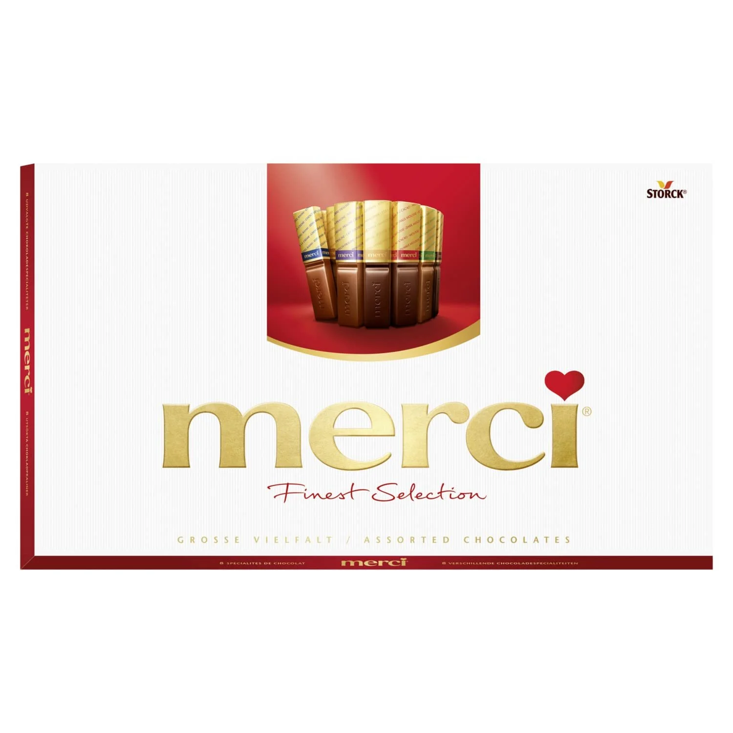
Here is the original chocolate box with a clean white background and luxurious lettering featuring the word 'Merci’
The design was created with a gold-bordered layout inspired by the Art Deco aesthetic, emphasizing elegance and sophistication. Additionally, the logo was repositioned to the center to enhance focus and create a more balanced composition.